KPI Definitions
The KPI Definitions module allows administrators to configure Key Performance Indicators (KPIs) displayed on the IoTRoutes dashboards.
KPIs provide quick insights into platform activity, operational health, and data trends — such as received messages,Faulty attributes, device status, job executions,workflow performance or attributes interpeter alerts.
Overview
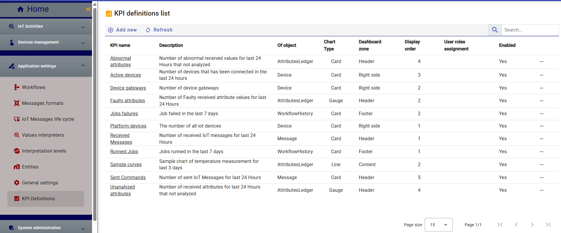
Accessible from Application Settings → KPI Definitions, this section lists all available KPIs with their descriptions, target objects, visualization type, and display zones on the dashboard.
Administrators can enable, disable, or restrict KPIs by user roles.
Each KPI definition includes:
- Name – Unique identifier for the KPI.
- Description – Short explanation of what the KPI measures.
- Of Object – The source data object (e.g., Device, Message, AttributeLedger, WorkflowHistory).
- Chart Type – Visualization type such as Card, Gauge, Line, or Column.
- Dashboard Zone – Preferred display location on the dashboard (Header, Content, Right side, or Footer).
- User Role Assignment – Optional visibility restriction for user roles.
- Enabled – Controls whether the KPI is active on dashboards.
KPI Definition Form
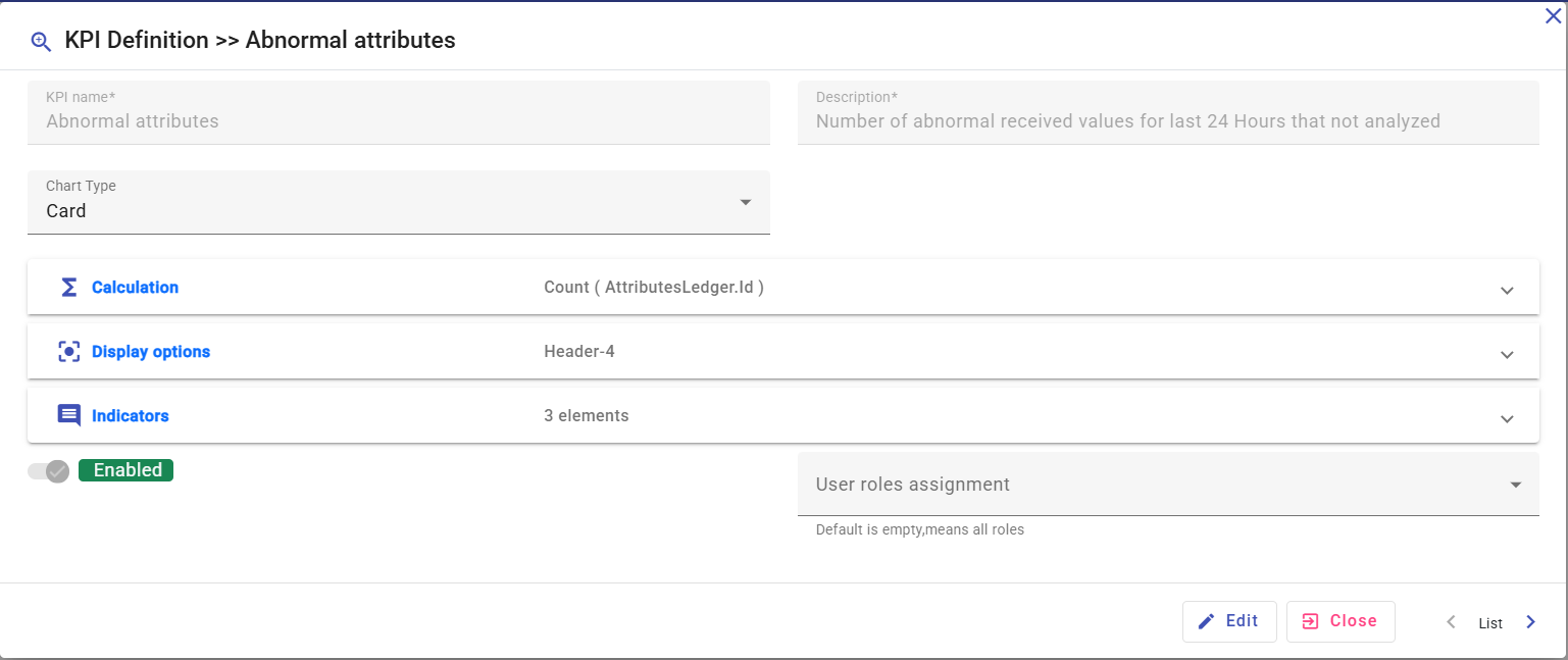
When creating or editing a KPI, the configuration screen is organized into three main sections:
1. Calculation
Defines the calculation logic for the KPI:
- Operation – Type of computation (Count, Average, Sum, Min, Max, etc.).
- Of Object – Source entity used for computation.
- Field – Field or attribute to apply the operation on.
- Calculation Period – Optional duration for time-based calculations (e.g., last 24 hours, last 7 days).
- Filters – Optional filters to refine results (e.g., status = Active, type = Temperature).
2. Display Options
Specifies how the KPI will appear on the dashboard by default.
Each user can later personalize their own dashboard using the Dashboard Customization feature — adding KPIs, changing their position or order, and modifying dashboard section titles.
- Zone placement (Header, Content, Footer, etc.)
- Display order and layout behavior.
- Default chart type (Card, Gauge, Line, Column).
- URL for Detail – Optional field that defines the page to open when the user clicks on the KPI card in the dashboard.
It allows drill-down navigation to detailed data views (e.g., message logs, device lists, or job histories) related to the KPI’s computed result.
3. Indicators
Defines how the KPI’s value is interpreted or visually highlighted:
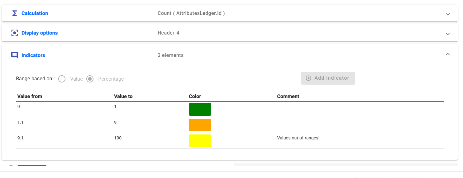
- Thresholds can trigger visual cues (e.g., color changes, warning icons).
- Values can represent absolute counts or percentages.
- Useful for conditional insights such as:
- “High temperature detected”
- “Value requires attention”
- “Activity level above normal threshold.”
4- User Role Assignment
Each KPI can optionally be restricted to specific user roles through the User Role Assignment field.
By default, KPIs are displayed to users whose roles are relevant to the KPI’s context.
This mechanism allows personalized dashboards, ensuring that each user sees only the insights aligned with their responsibilities.
For example:
System Administrators see KPIs related to infrastructure and platform performance (e.g., number of active devices, message throughput, failed jobs).
Functional Users view KPIs reflecting operational activities, such as received messages, processed attributes, or workflow executions.
Security Administrators have access to security-focused KPIs, such as number of user logins, failed authentication attempts, or suspicious access retries.
This approach improves clarity and reduces information overload while maintaining role-based visibility and data relevance across the platform.
Predefined KPIs
IoTRoutes includes several predefined KPIs by default, providing immediate insights into platform and device activities:
- Abnormal attributes – Number of abnormal attribute values received during the last 24 hours that were not analyzed. “Abnormal” refers to interpretation levels flagged by the Attribute Interpreter, as described in the Application Settings section.
- Unanalyzed attributes – Attributes that were received and normalized into the Ledger but not yet processed by any Interpreter.
- Active devices – Number of devices that have connected to the platform in the last 24 hours.
- Received messages – Total number of IoT messages received during the last 24 hours.
- Faulty attributes – Count of received attributes identified as containing anomalies.
- Job failures – Number of workflow jobs that failed within the last 7 days.
- Sent commands – Number of commands transmitted from the platform to devices.
- Sample curves – Example chart showing temperature measurements over the last 3 days, provided as a model for users creating custom chart-based KPIs.
Example: Faulty Attributes KPI
The Faulty Attributes KPI monitors the number of received attribute values flagged as faulty over the last 24 hours.
This KPI helps identify device anomalies or data integrity issues early, allowing operators to take corrective action.
Calculation Tab
- Operation: Count
- Of Object: AttributesLedger
- Field: (empty, as counting all records)
- Calculation Period: Last 24 Hours
- Filters:
AttributeStatus = Faulty
This configuration counts all attribute records classified as faulty during the last 24 hours.
Display Options
Chart Type: Gauge
Dashboard Zone: Header
Display Order: 2
The gauge chart provides a visual indicator of abnormal readings relative to normal operational thresholds.
Indicators Tab
Indicators are used to colorize or annotate KPI values depending on their range or severity.
For example:
| Condition | Threshold | Color | Meaning |
|---|---|---|---|
| ≤ 10 | Green | Normal | |
| 11 – 50 | Orange | Warning | |
| > 50 | Red | Critical |
This allows operators to instantly assess data quality trends on the dashboard.